Link to article: https://support.driveshops.app/support/solutions/articles/70000565611-kpi-app-how-to-create-a-comparison-graph
A Comparison Graph can be split into 2 categories: year over year for a selected period or period over period.

Here is how to create these graphs:
- Navigate to the Dashboards tab under the KPI app.

- Click on the Comparison Graph button.

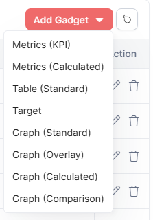
- If the Layout is any other, click on the Gadget button.

- Click on the "Add Gadget" option on the upper-rght side and select "Graph (Comparison)"
- At the bottom, you'll see the Comparison Graph is split into 2 options.
- If Dates in Previous is selected, the graph will display the Date Selection + X amount of years before that for the same selection.
- If Range of Dates In the Prior is selected, the graph will display the Date Selection + X amount of the same date selection before the original Data Selection.

- Average Prior Amounts will average all years and periods that are prior to the current Date Selection.


- Adjust the settings for each graph by clicking on the item you wish to change.

- If a KPI has been archived, toggle the switch in the top left corner. Archived KPIs will become available for graphing.
- A title does not need to be added before adding it to your KPI app dashboard and will default to the name of the KPI.
- Once done, click Save and the graph will be added to your dashboard.
Was this article helpful?
That’s Great!
Thank you for your feedback
Sorry! We couldn't be helpful
Thank you for your feedback
Feedback sent
We appreciate your effort and will try to fix the article